
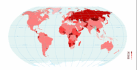
chart.info has a neat .info map showing .info market share by country. They have compared the number of registrations for each of the 5 largest gTLDs (.com .net .info .org .biz) and produced a map showing the relative market penetration of .info for each country in the world. This means you can quickly see in which countries .info is the nearest contender to .com and in which countries .info is slow getting established.

Leave a comment
Comments feed for this article